In May 2021, TSB Community Trust rebranded as Toi Foundation. It was a significant move that provides a platform to meet the current and future needs of our community.
The rebrand follows the release of our strategic framework and values, developed in 2020, which sees us continuing to support the region in our traditional philanthropic way, while also looking to the future with a focus on strategic and innovative grant making and impact investing, to achieve even greater long-term and transformational benefits.
The foundation has worked hard to develop and implement the new and more impactful strategic framework, purpose statement and values, to carry us forward into the future. To align, rebranding was the next step in the journey.
Rebranding
Over the last 33 years since our organisation was formed, the needs in our region – particularly economic and social – have changed markedly. A branding change to Toi Foundation better reflects some of the changes we have made to remain relevant, and also helps us to achieve our purpose, providing a platform to better support our community objectives, uphold our values and future direction.
To learn more about our brand and the meaning created, you can watch this short video, or read the descriptions provided below.
We’ve also prepared an FAQ resource for the rebrand.
TOI HAS TWO MEANINGS
‘origin and source’, and ‘tip or summit’; both reflect our organisation’s commitment to contribute to the success and wellbeing of Taranaki and its people.
The brand
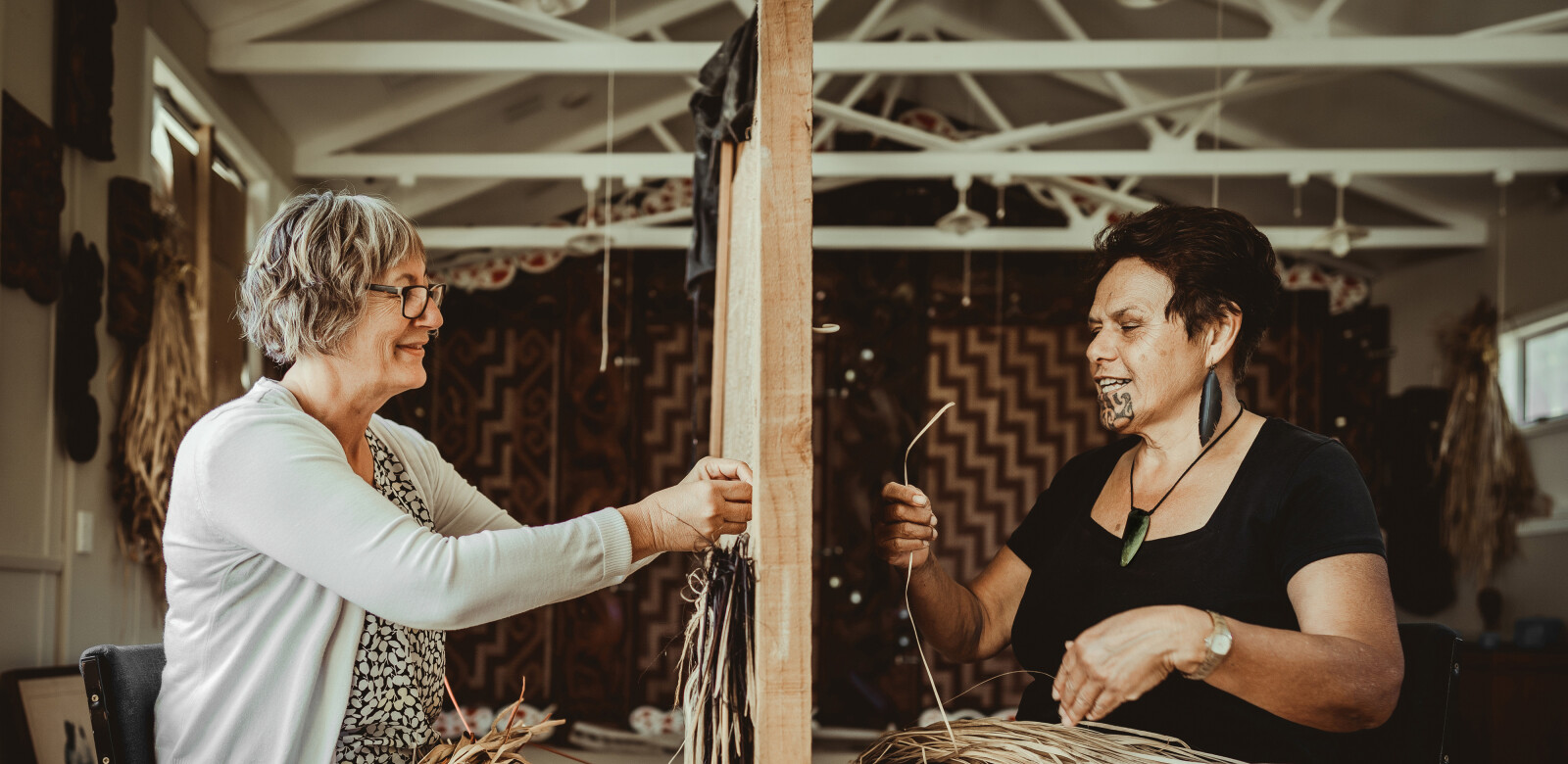
Our name and the logo design reflect our organisation’s aspirational vision for Taranaki – our people (coming together), our land and prominent landmarks, our history, culture and the importance of partnership.
The brand has a contemporary design which references the woven stitches of Māori tukutuku panels. Triangles that repeat within the design and a three-letter name, reflect Taranaki’s geographic landmarks (Taranaki Maunga, Pouakai and Kaitake) as well as Toi Foundation’s three strategic pou – Funding, Effective Organisation and Asset Management.
The ‘O’ of TOI is a ring that represents the area around Taranaki Maunga, that speaks of inclusion and collaboration. Supporting each other, united in community.
Alongside our logo, we have four contemporary designs that represent our organisation’s values – collaborative, focused, integrity and innovative. These are our brand expressions and you’ll see them on our vehicle, our signs and across the many touch points you’ll have with Toi Foundation.
Each of these graphic assets has been designed with reference to traditional tukutuku patterns, and meaningfully connect with our work and our approach.
Collaborative
- Together we are stronger
- Relationships are authentic, enduring and based on trust
The origins of this design can be found in a pattern known as purapura whetū, representing the stars and the people or population of a region. The traditional meaning of this simple cross-stitch pattern tells us that to survive as an iwi, a hāpu, a whānau, we must have numbers, we must come together (just as the stars of the Milky Way), otherwise we may be wiped out. For Toi Foundation this design talks about enduring relationships – together we are stronger.

Focused
- Targeted philanthropic efforts on areas of greatest need
- Deliberate in our actions
Toi Foundation’s targeting of philanthropic efforts on areas of greatest need is represented by the niho taniwha design – a saw-edged motif of tukutuku panels and tāniko weaving on the hems of cloaks. The teeth-like triangular shapes of niho taniwha are arranged in vertical rows with the apex at the top, symbolising strength, resilience and for some, the family houses within a tribe. We grow resilient communities by being deliberate in our actions.

Integrity
- Open and trustworthy
- Value differences and knowledge within the community
Takitoru, a tukutuku pattern used on cross-beams and panels in meeting houses, comprises single stitches placed in groups of three, at alternate angles. It represents communication, identification and special personal relationships. The sentiment sits with our efforts to be inclusive, open and trustworthy, and a commitment to value difference and knowledge within our community as we work together.

Innovative
- Pursue the new
- Grow from success and learn from failure
The stepped pattern of poutama symbolises genealogies and various levels of learning and intellectual achievement. In meeting houses, poutama panels are traditionally used in mirror image, so that the steps climb upwards from both sides to reach the summit at the centre. As we pursue the new as an organisation, we grow from success and learn from failure.

The process
The rebrand process involved our staff, trustees and consultants across the research and development phases. The name and design development was a collaboration between Taranaki-based brand agency Hall of Design, and Taranaki Māori art and design specialist, Hemi Sundgren.
The use of Foundation (in place of Trust) better reflects the work we do, in particular, our purpose to support our communities to build a thriving, inclusive and equitable Taranaki.
A foundation is “an organisation that has been created in order to provide money for a particular group of people in need of support”, while a trust is “a relationship where property is held by one party for the benefit of another party”.
Throughout the rebrand process, we were mindful that the meaning behind our brand needed to resonate with a wide range of cultural backgrounds, accurately reflect our organisation, and authentically speak to our community with relevance.